iA Presenter review
I hate slide tools.
I’ve used them since high school, from my first days using PowerPoint to later dalliances with Keynote and a corporate settling for Google Slides.
I’m a writer, and write my presentations in prose. With other tools this meant writing in iA Writer and pasting into the prompter section without a clear idea of how it will work when present, and cobbling together highlights ad-hoc as the actual slides. It sucked. In meetings or at a conferences I would panic as my notes disappeared.
With iA Presenter, I can focus on my writing. Finally.
How does iA Presenter work?
On launch, there is a default presentation which shows the features of the app. Each subsequent launch I chose to only see the file-picker. Unlike iA Writer, there isn’t a quick search, Library, or Organizer, but I could see the team adding this in the future.
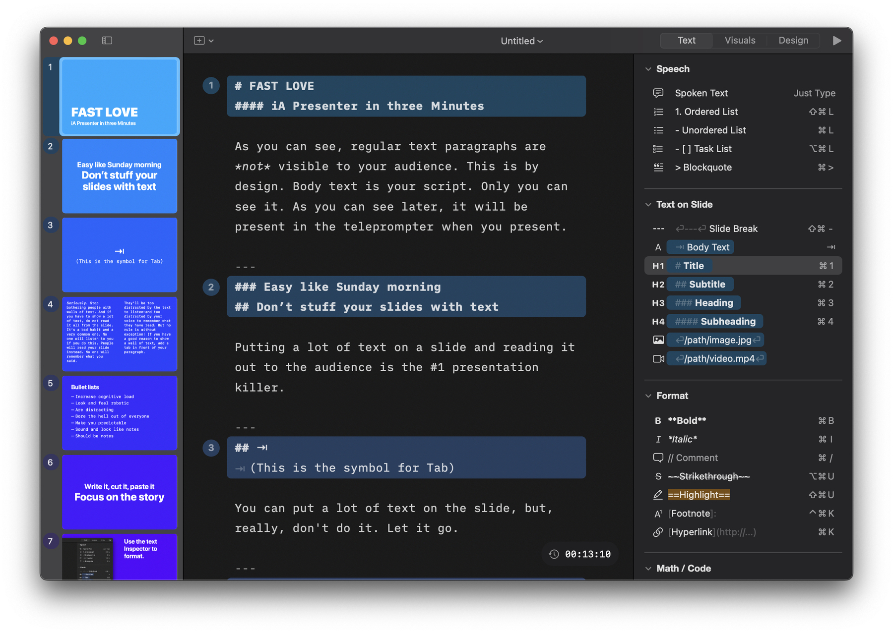
In a presentation there are 3 columns.
In the middle is the main text of the presentation, which also acts as the organizer, outliner, and design/layout tool. A simple --- creates a slide-break, and any text starting with a header or a tab appears on a slide. Other text appears in the notes section of the app during a presentation, unless it’s marked as a comment with double forward slashes: //. As a Markdown writer, when I write a presentation or import work from iA Writer, I only needed to add the slide breaks and I was most of the way done. Not needing to micro-manage each text and visual section, hoping to lock them to a grid was such a relief. The simplicity of the app’s appearance belies a deeper level of customization, and thoughtfulness.
For the rest of the app, the layout is straightforward as well:
The left sidebar shows a nice live-preview of each slide is a standard UX for slide tools, but iA Presenter’s minimal window meant it never felt cluttered.
On the right sidebar of the app, there are three panels for Text, Visuals, and Design. I love that the shortcuts for each text option are visible to ease the transition to typing-only, while showing the Markdown markup in the name of each element. Whether a user is a point-and-click person, or knows the dark arts of ==Markdown==, I think they’ll pick up iA Presenter quickly.
Using iA Presenter
At first, I used an old essay to test out the formatting and function of the app. It was tricky to determine how I wanted to pull things out into individual slides, but I quickly figured-out how to build emphasis and visual engagement. Discovering how headers and other elements functioned was part of the fun. The example text in the app on first launch is pretty great for this, but with a fresh document I got to do a bit of trial and error.
Next, I used iA Presenter to write and present Q3, Q4, and Q1 planning for my team—with speaker notes, and a shared presentation window in Huddles.
After my first presentation I tweaked how I organized my notes. Usually I want to keep a few things in mind throughout the presentation and with the notes moving along with the slides I occasionally wished I could float another note or overview.

Later, I used iA Presenter for a Japanese class and a few other small things, loving it every time. I don’t do a ton of presentations, but being able to drop in little essays and chunks of writing when I needed to ruled.
Wrap-up
iA Presenter can’t fix the other major issues with presentations (wrong adaptor or broken video chat), but they’ve fixed the rest. With their theming tool launched, I started copying over my job’s in-house style to make it easier to avoid Google Slides altogether. If you like writing more than aligning disparate elements, iA Presenter is the tool to use